In This Section
Introduction
Visit Napa Valley
The Visit Napa Valley Brand
Logos
Colors
Typography
Design Elements
Logos
Logo Guidelines
Minimum Size & Legibility
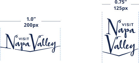
Horizontal Logo = 1 inch wide (print) and 200 pixels wide (digital)
Stacked Logo = .75 inch wide (print) and 125 pixels wide (digital)
Clear Space
The minimum required clear space surrounding all logos is equal to the width of the “N” capital letter type. This minimum space should be proportionally maintained as the logo is enlarged or reduced in size.
Do's and Dont's
Logo Misuse
It is recommended that the brand ambassador try to avoid these scenarios, or any scenarios not mentioned here, that can be seen as tampering with the brand, alternate brand or advertising logo’s visual effectiveness, thus diminishing the brand’s voice and message.
logo on busy background
logo on dark backgrounds
or color swaps
excessive drop shadows
shifting elements
warping
color changes
typographic changes
outlining
Acceptable Examples
The logo should only be placed on either solid colors or backgrounds that are not busy. If the logo is used on a photographic background, then it must be on a part of the image that is not busy. If the background is dark, use the reverse version of the logo.
Unacceptable Backgrounds
The logo should not be placed on any background that distracts from the logo or causes legibility issues.